Ammo Counter; Implementation

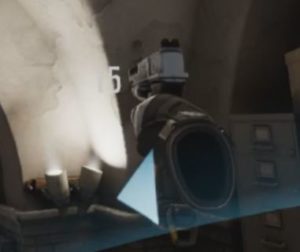
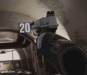
Continuing from trying to figure out this problem from the design standpoint, I moved onto implementation. It worked out that there was a good amount of real estate on the gun model for the ammo counter.
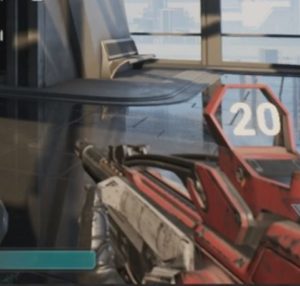
This works great, but what happens when you aim down sights?
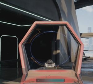
Obviously we have to remove the number, and that’s where our idea of the segmented progress bar works out.

This is our ‘machine gun’ example, and clearly reading individual ammo counts is difficult on the bar so let’s see how it looks with a lower count
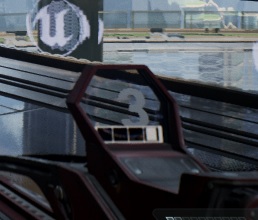
So it’s clear that you have 3 of 4 bullets, and that information easily readable whether you are scoped or not.

Next up, health display..
Diegetic Combat Text

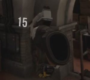
Continuing on my quest on getting more traditional UI elements in the game engine, I figured to go with the seemingly simple task of combat text. Having the text in-game not only adds some depth and interactivity, but in this case I gave it physics to interact with the static world.

The first big hurdle was that since the text is a physical actor in the world, it gets really small when far away. A simple solution is a algorithm to scale the actual actor based on it’s distance to the owner’s camera. I think it’s kinda strange but I actually like it.

Lighting was another unforeseen hurdle, typically the UI layer isn’t effected by lighting so is always pristine but once you put it in the game then you have problems seeing it in unlit areas. I had to do some material trickery to have it unaffected and still ‘pop’ from the rest of the world. In these clips you’ll notice the text’s reflection on the ground, another cool side-effect of the diegetic approach.

I don’t know if the result is better than just rendering on the UI layer, but I think the physics interactions are unique and just needs some polish to look awesome.

Simple text in VR

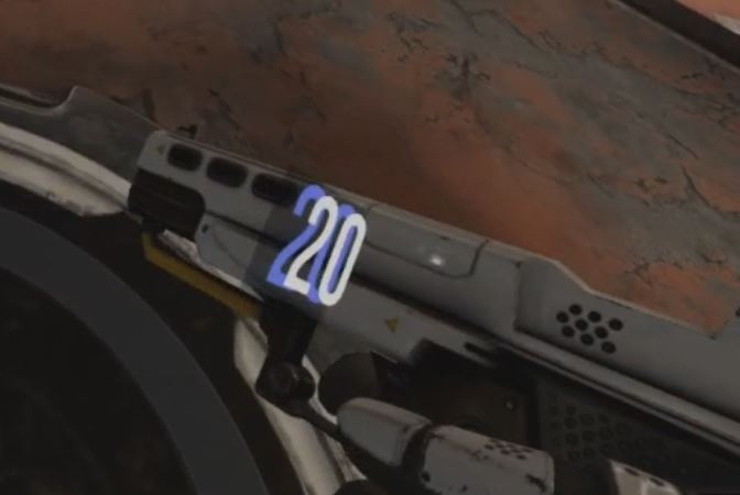
Finally getting around to the Robo Recall Modkit and instantly I see a pet peeve of mine, the ammo text on guns

Looks fine, right? Let’s see it on a light background

Of course, we lose readability. Here’s my seemingly simple solution:

Stroke and a black background? Well, sorta, if you take a closer look you can see there’s depth and layers, and a tinted glass background to mute in every situation.

Layers stacked in Z-space looks great in VR as you get that Parallax effect. I initially wanted to limit the angle of the text so it was always facing the camera but it wasn’t even necessary, the layers make it readable at almost any angle.

The UI layer keeps dying..

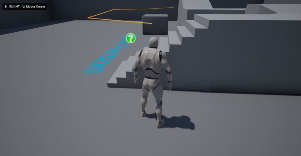
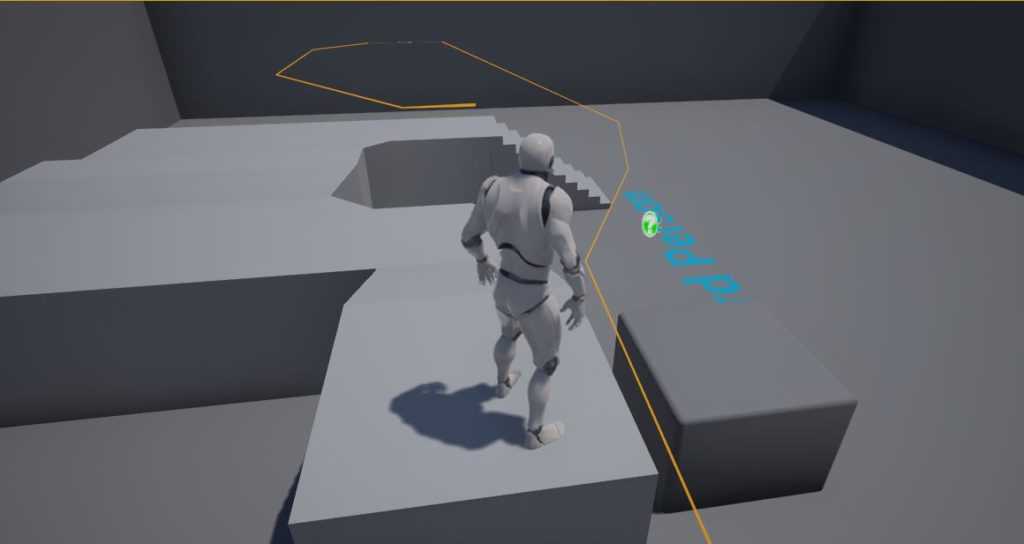
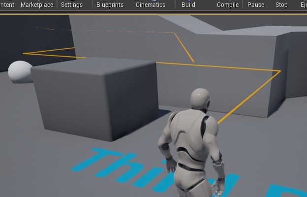
While working on the recent Ludum Dare, a few friends asked for a quick component to show a path to a target point. Instinctively I started working on converting 3d points to 2d lines.

It was a complicated translation, but it worked. It was clear that it wasn’t going to hold up with complicated paths with varying depth.

I started ‘fixing’ it to change it’s look based on the distance from the camera and then had a moment of clarity, why not just render the path in the 3d space? It’s a solution that I seem to come about more and more lately.

A lot better, now it can have natural depth, be effected by lighting and match post-processing effects in the game.