A Critique in Hunt’s Game Design; At a Glance

In another entry to my ‘A Critique in‘ series, this is more of a raw list of problems or issues I’ve had while playing in the past month or so. As I play more, I hope my thoughts will crystallize to form a more cohesive critique that I can make a video with supporting footage.

What works

  • There’s a lot of features that force conflict; Burning bodies, heal from banish, bounty escape. This prevents camping or slow gameplay.
  • Customizable health bars is genius. Losing health bars different from damage, death , and burning.
  • Interesting meta-game, deciding how much I want to risk on a character. Do I play a shitty character for my warmup game? Low-risk, low reward.
  • Audio-driven gameplay. Player-driven sound cues are littered throughout the map, all with intention and purpose.


What needs help

  • AI
    • It’s important that ai and bosses aren’t made more difficult for a new players or solo players, but currently killing AI as a good player or a team is trivial. Need to increase the difficulty/dynamic ceiling without increasing the floor.
    • AI difficulty comes from knowledge/planning, not execution.
    • AI isn’t dynamic enough, watch any streamer and you’ll see how calculated their attacks are. Monotonous. Predictable. Non-threatening.
  • New players can’t lose their character and are completely oblivious to one of the most unique and important aspects of the game.
  • High level players don’t play the game as intended, they run around making as much noise as possible with unlimited money.
  • Almost all talent customizations are upgrades, not sidegrades.This makes talent selection less interesting and thus, limits talent power.
  • No tracers on bullets, therefore no corrective mechanism.
  • Stagnation caused by camping. Camping is caused by being punished for moving(sound). There needs to be more tools to combat camping.
  • One-shot kills. Currently there are too many ways to achieve it. It’s not terrible in team games (where you can be revived) but it should be practically impossible in solo. This includes sniper rifle headshots, shotguns up-close, and crossbows.


Lack of build diversity, roles, archetypes, and team synergy

There are hints of the ability to ‘customize’ your character but there’s no real reason to. All the pieces to diversive builds that support different playstyles and archetypes exist, but aren’t taken advantage of.

Reasons people don’t have diverse builds:

  • There’s no limits, you can eventually have everything(theoretically). Nothing forces you to make hard decisions.
  • Equipment can be acquired/changed at any time. If you don’t like a previous character choice, you can change it.
  • Battle environment is unknown and dynamic. Ie. I can’t plan to use a flashlight unless I know it’s a nighttime map.
  • Limited talent/weapon/tool pool for low level players. New players don’t have enough options to make real choices.


Potential solution in new Game Mode

To encourage build-diversity, players are given a partially built Hunter. They’ll then have to build out the Hunter with limited resources to encourage a ‘build-around’ the starting loadout. Map specifics are known ahead of time to also impact builds.

  • Have to recruit a “Limited Hunter” for $500
    • Starts with ~$300 worth of equipment. 
    • Starts with ~15 upgrade points’s worth in talents
    • Customization:
      • You are given $250 to spend on equipment. You can unequip default equipment but you can’t sell it.
      • You are given 10 upgrade points.
  • Limited Hunters are gone after the game, win or lose, there’s no way to keep them.
  • Details of the contact are known when you pick your hunter. Including the map, time of day, etc..
  • Rewards:
    • Percentage of the XP gained in the mission is cached out in gold.
    • Extracting lets your keep all you equipment


Content Ideas

  • Spirit mode that shows player footsteps. These steps would fade away over time.
  • Spirit mode that makes players emit smoke that can be seen through walls. This effect would stack to identify camping.
  • Fire extinguisher item that also emits smoke
  • Map with rain, this would essentially cancel out most soft sounds(player footsteps)
  • Teir 3 traits, these should be expensive (10+ points) and be POTENTIALLY very powerful.
  • More  equipment that affects the zombie, like a swarm grenade that attracts zombies to a target area.
  • Roaming boss that forces conflict between players
  • More talents around bullet penetration
  • More indirect/utility-bases equipment

A Critique in Anthem’s Game Design

Disclaimer* This is a critique on some of the game design aspects of Anthem. This is not a review, I’ll be ignoring most of the major technical issues and ovious(or more egregious) issues covered by others.

Since we’re going to focus on some of the problems with Anthem, let’s start with one of the best aspects of the game, Movement. We’ll also be able to use this feature as a watermark for quality.

Anyone who has seen Anthem’s movement already knows it’s appeal, but FEELING it is another thing. The propulsion sounds are so loud it’s deafening, you can feel the weight of your javelin on take-off and even more-so on landing. It’s much harder to gain altitude than lose it. Dodging side-to-side makes your feel like a fucking fighter jet.

Perhaps more impressively and definitely understated and little-understood are flight’s mechanics. There depth of it from javelin to javelin and how it changes their playstyle. It’s fun to figure out, what’s faster, flying or dodging? If jumping resets my dodge count, should i jump twice to get the most dodges? What if I cancel my jump into a dodge then cancel that dodge into a melee attack and cancel that? Learning this quickly exposes another great aspect of movement, physics. Dodgding, jumping, melee aren’t canned animation that move you in a fixed way, it physically propels your javelin forward and that momentum can be leveraged and manipulated to use the flexibility of this system to move you in ways faster than just flying.

This game mandates that you travel a lot and the movement system almost makes you look forward to that travel and ignore the face that in most cases you blindly flighting in the direction of an ever changing waypoint on your hud.

Luckily, some of the charm from movement spills over into the abilities. You can feel the Colossus air slam, even without a controller with vibrating controller. The Ranger’s spark beam is done better than iron man in infinity war. When you combine the movement system with the Interceptor’s  ability it can show the actualized full potential of Anthem. They all feel great, and some of them even have great mechanics. You can slam the ground,go into a melee, cancel the melee’s backswing with a dodge and toss a quick grenade.

This doesn’t apply to all abilities, some have unique problems, like interceptor’s ult which is painfully simplistic and limiting. Others suffer from a problem that exists throughout multiple systems in the game, Unresponsiveness.

The shield, for example, doesn’t always show when you need it to. It takes a half second longer than it should to come up, sometimes dodging right before an attack is just doesn’t come out in time. Interceptor abilities have a little too much startup and breaks the intense flow of combat. Even switching weapons takes forever.  Suddenly the ability to cancel animations doesn’t apply when you can’t bring up your shield due to the .3 second animation to put your weapon down.

This problem rears its head in things outside of abilities, certain actions just don’t give you any feedback. Press fire while holding an unscoped sniper rifle? Nothing happens. Press fire when you weapon is empty? Nothing happens.

It’s a problem of communication and it’s one of the biggest problems that game has, it fails to relay information, especially with weapons.

Take a look at this screenshot. I have a X and a X equipped, how can i tell which one im currently holding? Does the weapon icon help? The reticle? The model itself? What’s the exact progress on my current reload? This failure to reliably relay important information isn’t limited to Weapons.

There’s no distinct sound when your shield breaks, or when your abilities have finished their cool down or if there’s a homing projectile about to hit you from behind. Couple these problems with the game graphical clusterfuck(which btw, you can’t downgrade) and it leads to one of the most common reactions found in Anthem. <Clip of me dying and saying “what the fuck just hit me?!”>

Missing these cues is particularly bad in Anthem because the way combat works means you’re constantly being attacked from any angle. A problem that other looter shooters (destiny, especially division) because they’re created in a very linear way where enemies typically spawn straight ahead. The flight system in anthem ensures not only will you be attacked from behind, but also above and below. So when some enemies poof into existence with no notification at all (no sound, no rift) and the existing a/v cues are less prominent than other games(expand on this a bit more).

Anthem doesn’t just suffer in missing these features, but it fails to implement any ideas of it’s own. Anthem doesn’t innovate in any way. This lack of innovation comes out in many aspect of the game

  • Weapons
    • Emphasis on spread instead of recoil
    • No innovation, compare to UT99
    • Guns have cooldown instead of reloads?
    • Lack the feel that abilities/movement have.
  • Mission
    • Completely uninspired, deserves it own video.
  • Enemies
    • No innovation
    • Dumb ai (Doesn’t allow me to counter-player outsmart) .There’s a variety of enemy types and some of them even have special mechanics but there’s no difference in AI. They don’t react to what I’m doing and I can’t react to their moves. Their actions are repetitive and predictable.
  • Story
    • Actors are over-acting with their body. Feels like a play being enacted in front of you. They awkwardly don’t move far from their starting pose.

Uncanney valley.

Customization/Gear

  • Segments customization into modular/digestible chunks.
    • Each chunk is tied to a specific piece of armor (no passive perk selection)
    • This has to be done in a game where you can swap characters whenever you want. This is a modern move, old way was WoW or Division, new way is this and division 2.
    • No attribute distribution

Unfortunately a lot of the good parts are completely undermined by progression

  • Consumables suck, they undermine your build
  • Progression
    • No path to acquisition
    • I can do an entire mission on the hardest difficulty, if i don’t get a piece that is better than what i have, it’s pointless.
    • Useless item drops leads to inventory space problems and the deaded inventory management. Forces you to delete things that you might want in the future.
    • it’s a looter shooter and looting isn’t fun, doesn’t tease masterwork gear so i have nothing to look forward to
    • Potentially one of the most interesting aspects of the game. I say ‘potentially interesting’ because I’ve yet to truly have the opportunity to try to customize my build:
      • You’re kind of forced to use the highest level gear all the way to 30. The the same things applies to endgame and is eve worse because you HAVE to use whatever legendaries happen to drop.

Sacrificing UX for X

  • Tarsis
    • has mouse smoothing and blur.
    • Why do I have to wait for the fucking javelin to turn around?
    • Why walk(slowly) from point to point.
  • Friendlies have collision. You shoot colossus ult and a friendly walks in front of you. Running into teammates stops you from running.
  • Radar sucks.Intentionally obfuscates position. I know what they were trying to do (don’t want people staring at HUD elements), but they failed in both way.


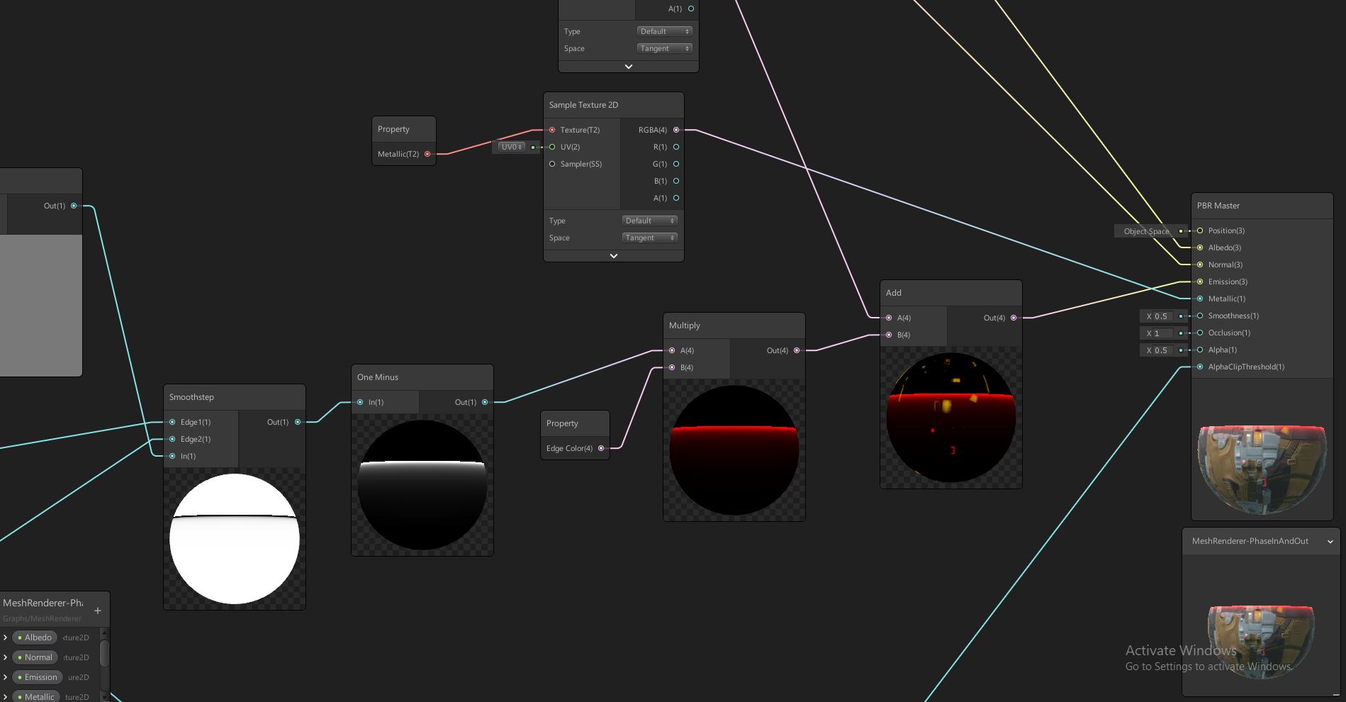
Why I’ve avoided Shader Graph

Shader Graph has been out for a while now but for some reason, it’s something I’ve always avoided. In a way, crystallizing on why that is has helped me understand what aspects of game development I don’t actually love. There’s two main aspects of this feature that kept me away; Low-level, math-focused programming and the creativity needed in an artist. Forcing myself to use this feature helped me understand these aspects and reflect on their relationship to my career. When one makes the decision to name them self an Engineer, they naturally want to excel at all the aspects that fall under that umbrella, otherwise is to fail in some way. What I’ve learned is that acknowledging my limitations in ability and interest will result in excelling in the areas that do motivate me, which inevitably leads to more productivity and better quality work.

Personal experience aside, Shader Graph is an extremely useful feature in implementing even basic visual effects. I learned of it’s usefulness not only on Mesh Materials but also how it could be used on sprites and particle systems:

If I’m being honest, I think the real reason I wanted to get familiar with this feature is just so I could get some experience with Unity’s official implementation of visual scripting. With that said, it felt very familiar to other visual scripting solutions with the only real feature that stood out was the gradient-colored connections between nodes. I’m hoping to see some innovation in their implementation in the future, but at the very least, they have a ton of examples to learn from.

The problem of scope under tight time constraints

I had an idea, make a simple game using the ‘standard’ Unity approach then remake the same game with Bolt and again with ECS. I wanted to really see the practical differences, the strengths and weaknesses of each approach. I knew it would have to be a very small scale project to keep things simple so I went with the classic Flappy Bird. Immediately starting the first version of the project I began to run into the same conundrum that I always run into when doing small-scale projects or gamejams, how much do I invest into foundational architecture and keeping things generic versus just getting shit done.

The Game Jam dilemma

This is a problem that I’ve never really took the time to nail down. I also think deep-down sometimes I claim to make decisions that may not be perfect with the excuse of time constraints (when the reality is that I may not actually know what the perfect solution is, or just too lazy). There’s also the lingering knowledge that “if i would have done it this way, then it would have worked out better” but the reality is that you’ll never know because you typically never go back and make that change and the game’s scope is small enough that is ultimately doesn’t matter.

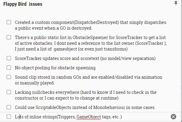
So I had a new idea, I’ll make the game as if I’m under gamejam conditions but keep track of all the shortcuts, crossroads and architectural decisions I’ve made that are suspect. Afterwards, I will expand the game and see what decisions were the right call and what screwed me later in development. I can also go back and perhaps do things different just to compare which way was faster.

Here’s an example of some of the notes I took:

As always, here’s the source.


New Challenge; The Ammo Counter

My latest exercise is to take take a modern FPS and remove the entire HUD from the UI layer without losing any information. The first element to tackle is the ammo counter.

So what information does the ammo counter need to relay to the player? If I have an energy weapon or a minigun with a massive clip, do I need to know exactly how many bullets I have left? Probably not, I’d prefer a progress bar. However, if I had a bolt-action sniper rifle then I would want to know exactly how many bullets I have left. We don’t want to solve this with 2 different solutions and we don’t want to display information we don’t for one or the other. The solution is the best of both worlds, a dynamic segmented progress bar:

Assuming the top bar is our minigun example, I can’t quickly decipher exactly how many bullets I have left but I know it’s roughly 25% and that’s all I need know. The bottom bar is our sniper rifle and even with the bar in my peripheral vision, I can quickly tell I have 2 shots left.

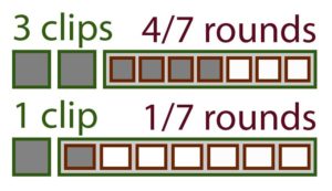
Now, things get tricky when you factor in your extra magazines. I like the idea of keeping it all in one bar to keep simplicity by nesting the segments like so:

Although I like this solution, it doesn’t scale well if you have 3+ mags. It’s at this point I start to question how useful that information is, why do I need to know that I have 17 mags in my bag? The truth is that I probably don’t, at most I need to know if I have another mag after my current one in empty. That’s a binary value, do I have another clip or not. A binary value is a lot easier to display, but I digress, let’s move past that issue for now and move onto actual implementation…